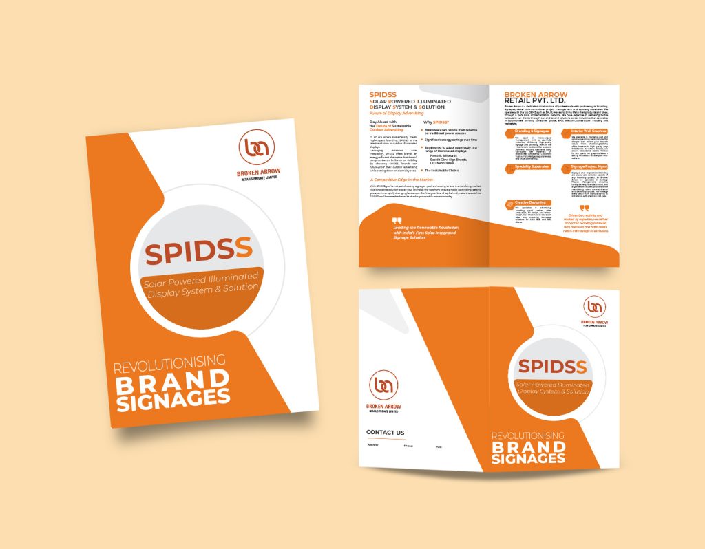
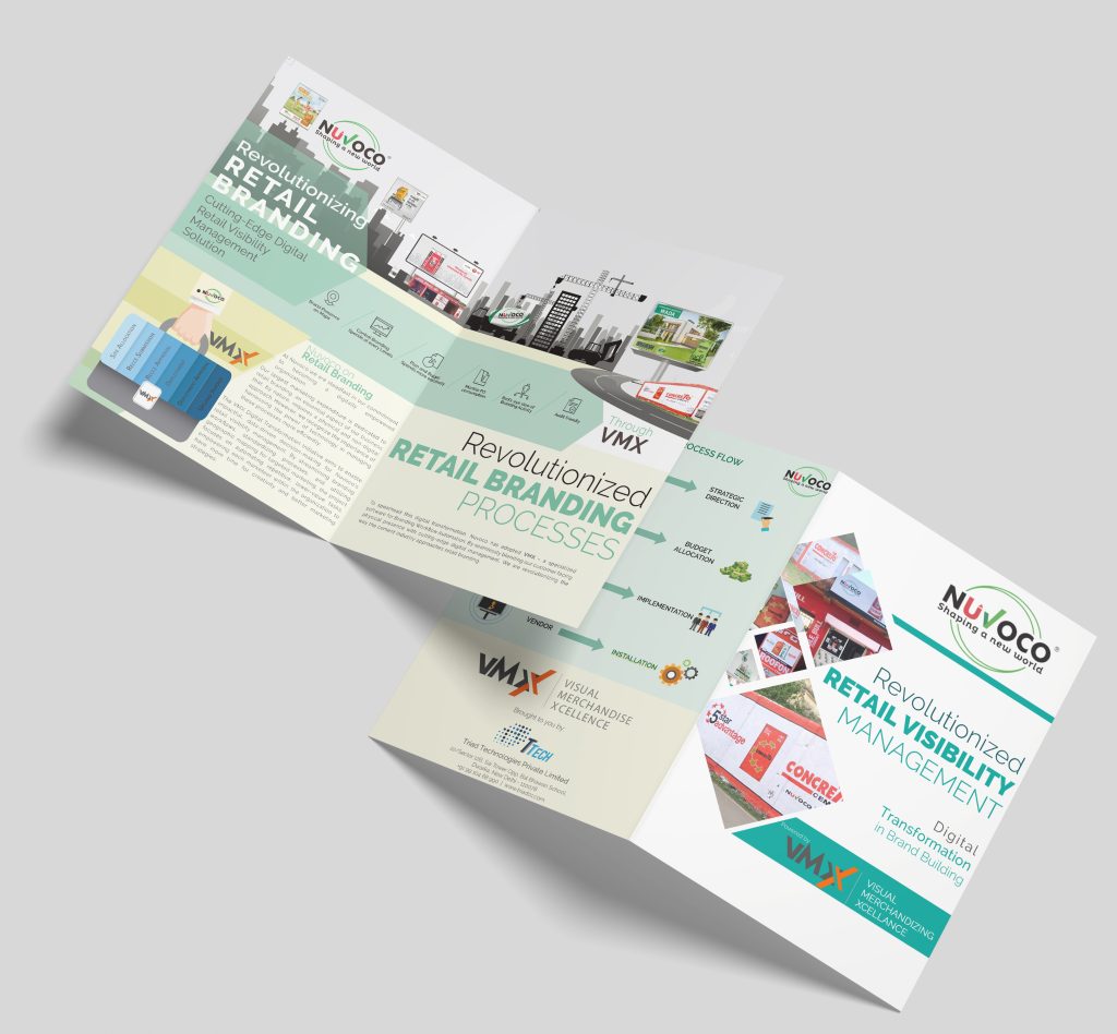
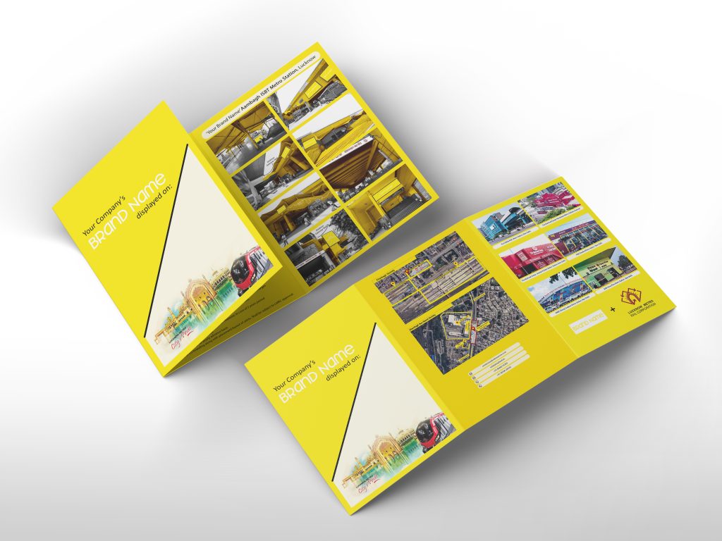
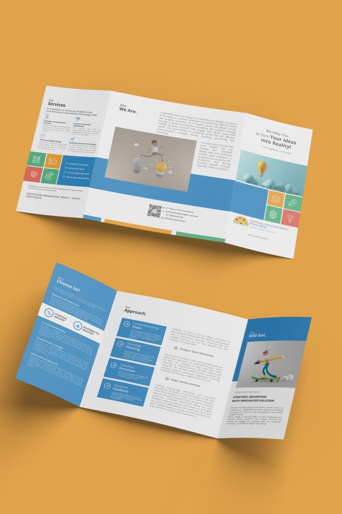
Marketing collaterals
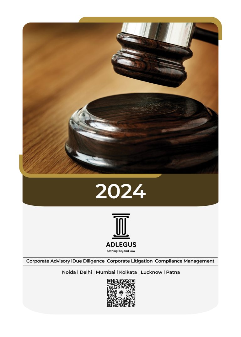
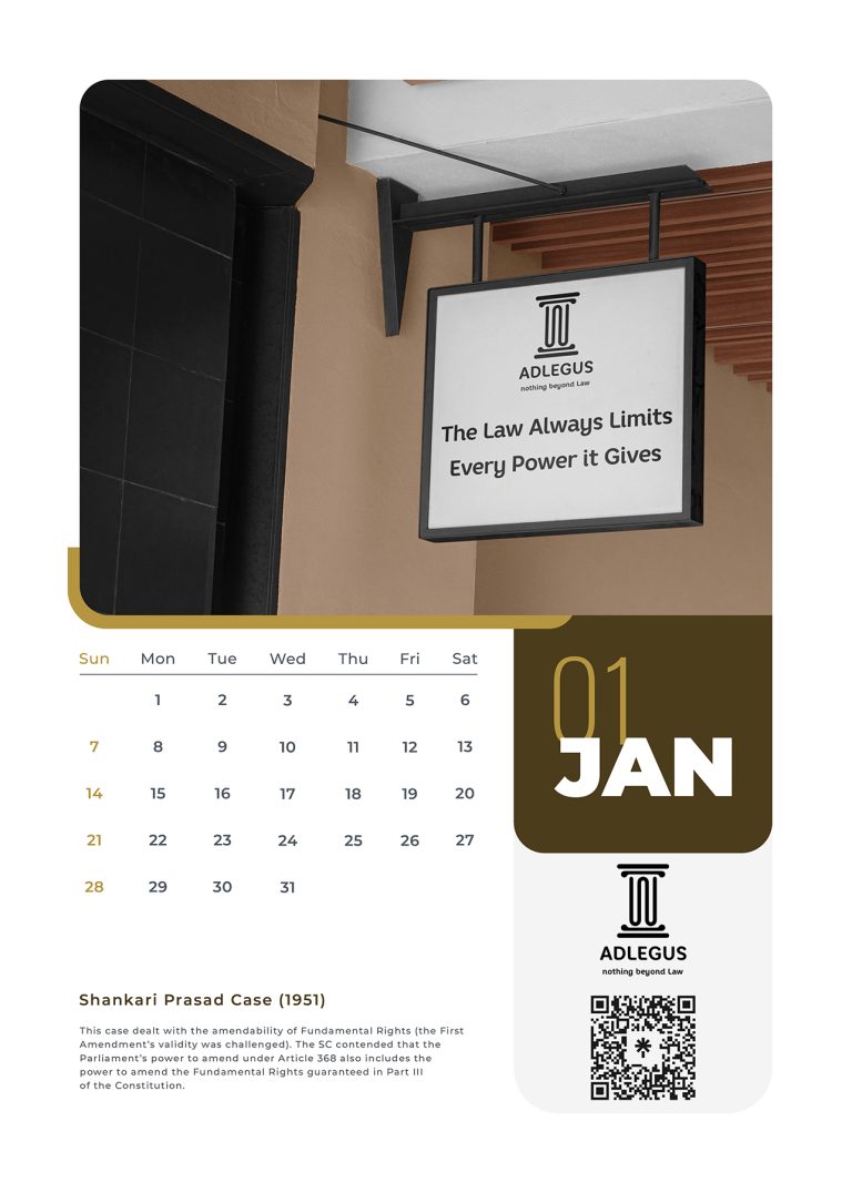
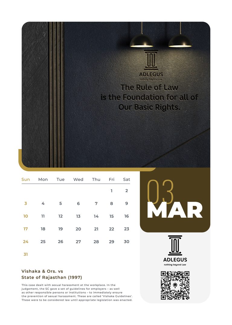
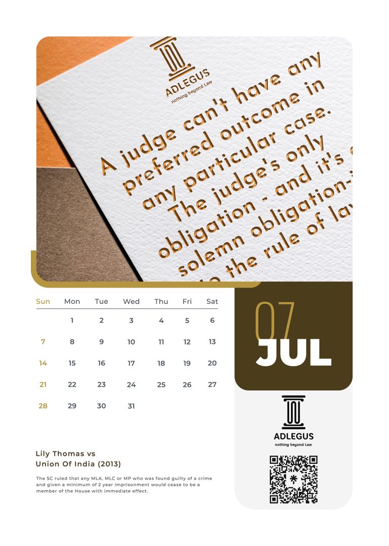
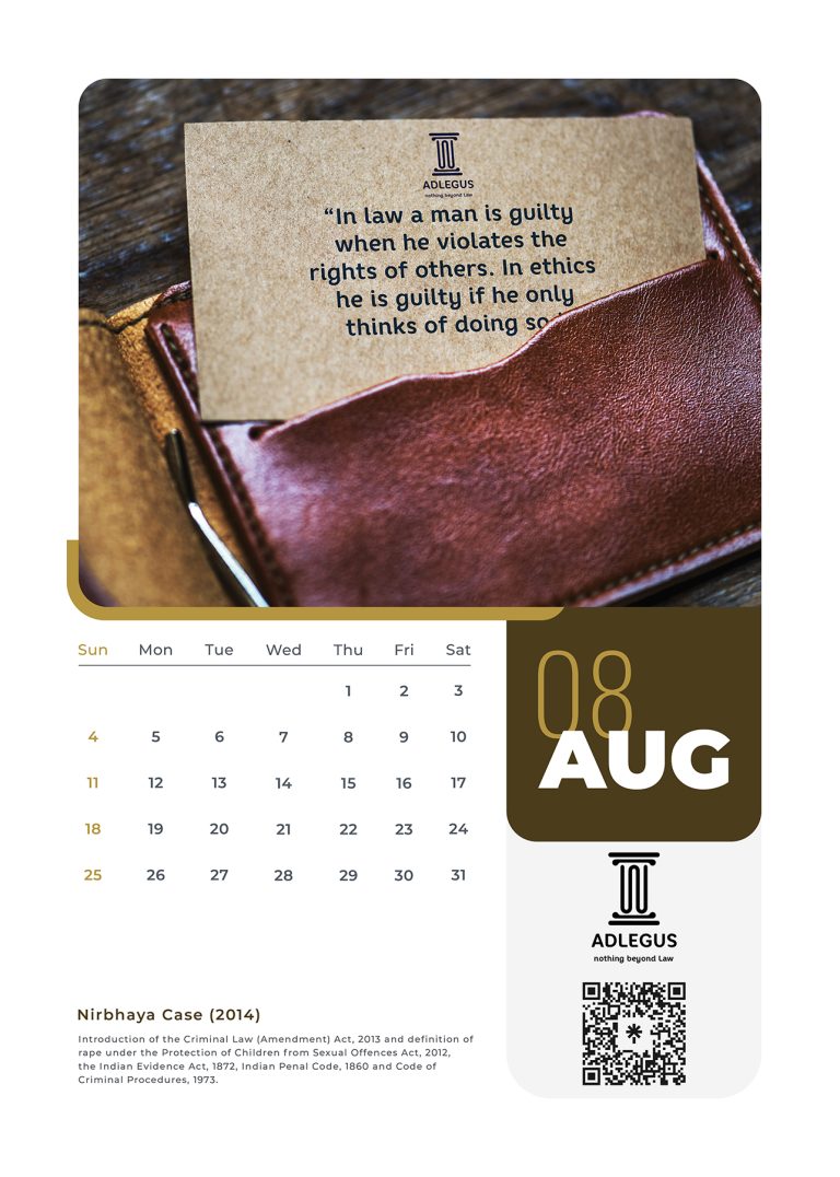
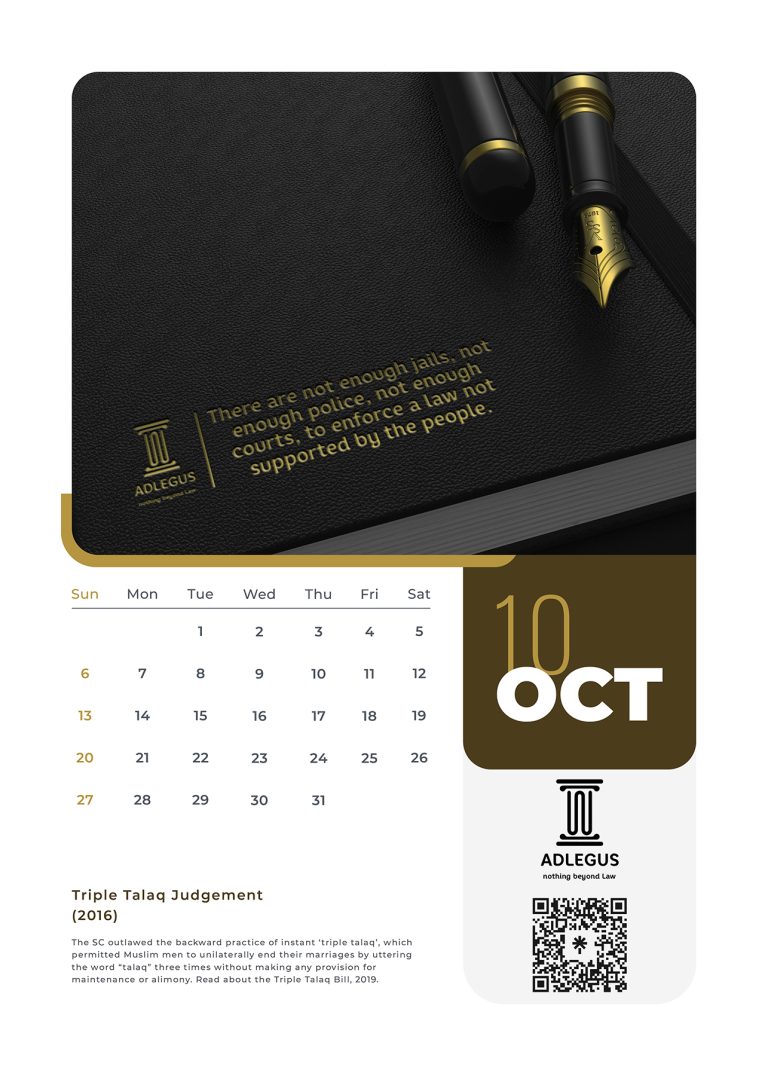
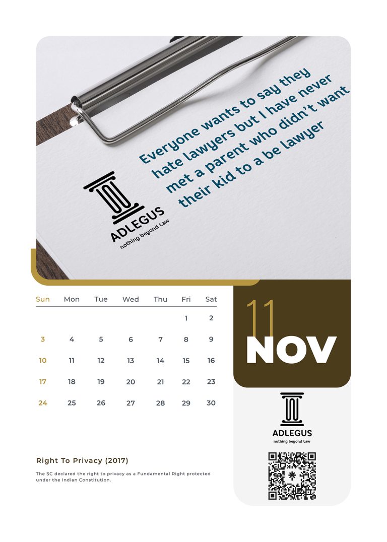
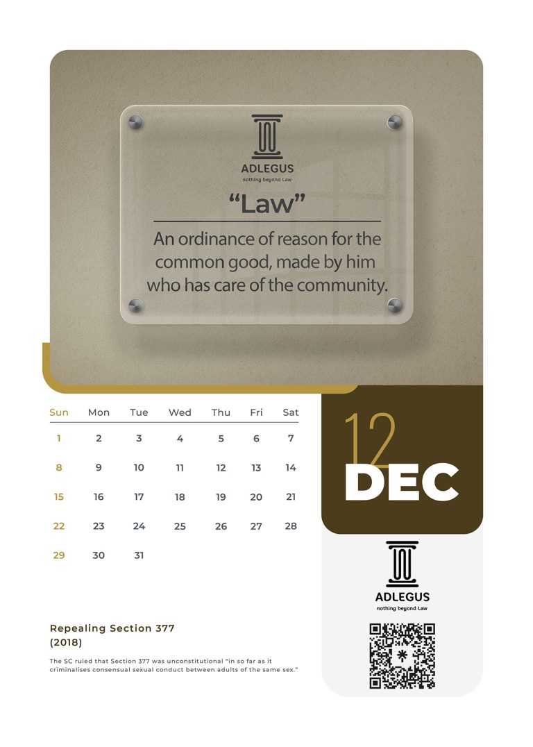
marketing is communication & collaterals are its tools
Our logo designs are more than visuals—they are stories in their simplest form. Each logo reflects the essence of the brand, crafted to communicate its purpose,
personality, and promise in a single glance. From modern minimalism to expressive identities, we create symbols that connect, inspire, and leave a lasting impression.
Brand ADs
Advertising is the voice that completes brand communication
Our logo designs are more than visuals—they are stories in their simplest form. Each logo reflects the essence of the brand, crafted to communicate its purpose,
personality, and promise in a single glance. From modern minimalism to expressive identities, we create symbols that connect, inspire, and leave a lasting impression.
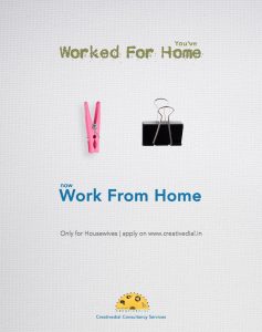
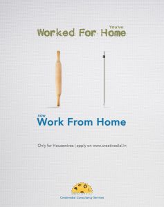
Campaign Title: “You’ve Worked For Home. Now Work From Home.”
Campaign Insight
When the COVID-19 lockdown hit, the world shifted to a “Work from Home” model — but for millions of Indian women, especially housewives, working for home wasn’t new. They had already been doing it — unpaid, unnoticed, and uncelebrated.
This campaign didn’t just tap into the zeitgeist — it challenged it.
It flipped the popular narrative by recognizing the invisible labor of homemakers and offering them actual work-from-home job opportunities through Creativedial’s creative hiring platform.
Purpose and Impact
The goal was not just creative hiring — it was creative dignity.
By bridging domestic tools with professional ones, we positioned homemakers not as passive dependents, but as skilled, capable contributors ready for the digital workforce.
This wasn’t CSR-wrapped advertising. It was design with a cause — triggering conversation, shares, and real inquiries for remote work.
Why It Worked
-
Culturally contextual: Used everyday objects every Indian home recognizes.
-
Emotionally resonant: Validated a life of unpaid labor with opportunity.
-
Minimal yet memorable: Smart contrast, visual poetry, and clear CTA.
LookBook Pictures Campaign – “We Do Not Offer Packages”
In an era of cookie-cutter wedding photography where agencies push Bronze/Silver/Gold packages, LookBook Pictures stood for something else: emotion, not deliverables. They didn’t want to be picked from a dropdown list—they wanted to be chosen as artists.
To support this radical positioning, we created a dual ad campaign that disrupted the very idea of “wedding packages.”
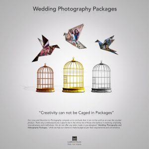
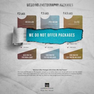
One visual depicted birds flying out of cages labelled Bronze, Silver, and Gold with the powerful line: “Creativity cannot be caged in packages.” The second visual featured the standard package chart—visibly torn apart with the line: “We do not offer packages.”
More than just a promotion, this was a philosophical stand—aimed not only at clients but also at fellow photographers caught in a pricing rat race. LookBook Pictures emerged from this campaign not just as service providers, but as artists with a manifesto.
Campaign Story: Reimagining Trust & Nostalgia for a New Market Entry
When Delhi Stock Exchange (DSE) — a dormant regional stock exchange — planned its re-entry into a market completely dominated by BSE and NSE, the challenge was not just visibility, but relevance. We were not selling a product — we were selling trust in an institution long absent from public dealings, now ready to write a new chapter.
But how do you build credibility when you’re late to the party?
That’s where the idea was born: “Let’s not compete where others shine — let’s own what they’ve left behind.” While digital creatives were flooding financial marketing with graphs, statistics, and jargon-heavy ads, we chose to go the other way.
We created a hand-painted visual campaign with a narrative feel — invoking mythology, metaphor, and nostalgia — each creative acting like a chapter in a timeless financial folklore. These weren’t just visuals; they were storytelling artefacts designed to make you stop, smile, recall, and relate.
The Concept Behind Each Creative
-
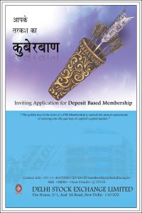
कुबेरबाण (Kuberbaan): A modern twist on the divine archer’s quiver, where each arrow was made of currency notes — symbolizing how each DSE membership empowers you with the arsenal of wealth creation.
-
Unlock the Opportunity: A key marked “DSE” opens a padlock made of currency notes — a symbolic representation of how this membership unlocks your access to India’s capital market.
-
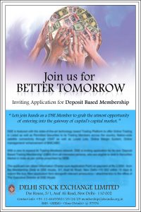
Join Us for Better Tomorrow: Multiple hands hold a globe made of global currencies — showcasing unity, ambition, and the DSE’s intent to bring diverse players together into the financial mainstream.
-
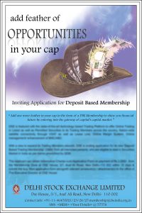
Feather in Your Cap: A vintage cap adorned with money-feather quills — celebrating a DSE membership as a prestigious addition to your financial journey.
Impact Beyond Imagination
This wasn’t just a creative detour. It was a calculated risk — and it worked. The campaign brought in 100+ crore INR through deposit-based memberships. It resonated with not just veteran brokers but also with first-time entrants, younger investors, and regional intermediaries who longed for simpler storytelling in the complex world of finance.
Certificate of Aspiration
This ad, modeled after the SEBI-issued broker certificate, was designed as the second push in a larger campaign for the Delhi Stock Exchange’s Deposit-based Trading Membership program. It was strategically crafted to ignite ambition and credibility among the thousands of sub-brokers operating under NSE/BSE who had long aspired to become direct members of an exchange. By replicating the aesthetic of an official certificate, the ad invoked both prestige and legitimacy, creating a strong aspirational pull. Its publication on the front page of leading national newspapers delivered immediate visibility and market-wide buzz—successfully transforming a compliance-looking format into a powerful recruitment and branding tool.

Amnesty Scheme: “Correct the Incorrect” Ad
When DSE was preparing for its nationwide online launch, it needed compliance from over 75% of its 2,200 listed companies, many of whom had been dormant. Despite publishing notice ads, the response remained low. Upon analysis, we identified the core problem was cognitive bypass — the right people simply overlooked or ignored the ads amidst routine notices. Our solution: a display ad that couldn’t be skipped. We moved from newspapers to financial magazines with high shelf life and created a message that played on the theme of correction and compliance. The phrase “correct the uncorrect incorrect” stood out for its wit, simplicity, and direct connection to the amnesty scheme’s objective. The campaign was also extended to emailers using the same language, resulting in a notable increase in company responses.

Campaign Title: “You’ve Worked For Home. Now Work From Home.”
Campaign Insight
When the COVID-19 lockdown hit, the world shifted to a “Work from Home” model — but for millions of Indian women, especially housewives, working for home wasn’t new. They had already been doing it — unpaid, unnoticed, and uncelebrated.
This campaign didn’t just tap into the zeitgeist — it challenged it.
It flipped the popular narrative by recognizing the invisible labor of homemakers and offering them actual work-from-home job opportunities through Creativedial’s creative hiring platform.
Purpose and Impact
The goal was not just creative hiring — it was creative dignity.
By bridging domestic tools with professional ones, we positioned homemakers not as passive dependents, but as skilled, capable contributors ready for the digital workforce.
This wasn’t CSR-wrapped advertising. It was design with a cause — triggering conversation, shares, and real inquiries for remote work.
Why It Worked
-
Culturally contextual: Used everyday objects every Indian home recognizes.
-
Emotionally resonant: Validated a life of unpaid labor with opportunity.
-
Minimal yet memorable: Smart contrast, visual poetry, and clear CTA.
LookBook Pictures Campaign – “We Do Not Offer Packages”
In an era of cookie-cutter wedding photography where agencies push Bronze/Silver/Gold packages, LookBook Pictures stood for something else: emotion, not deliverables. They didn’t want to be picked from a dropdown list—they wanted to be chosen as artists.
To support this radical positioning, we created a dual ad campaign that disrupted the very idea of “wedding packages.”
One visual depicted birds flying out of cages labelled Bronze, Silver, and Gold with the powerful line: “Creativity cannot be caged in packages.” The second visual featured the standard package chart—visibly torn apart with the line: “We do not offer packages.”
More than just a promotion, this was a philosophical stand—aimed not only at clients but also at fellow photographers caught in a pricing rat race. LookBook Pictures emerged from this campaign not just as service providers, but as artists with a manifesto.
Campaign Story: Reimagining Trust & Nostalgia for a New Market Entry
When Delhi Stock Exchange (DSE) — a dormant regional stock exchange — planned its re-entry into a market completely dominated by BSE and NSE, the challenge was not just visibility, but relevance. We were not selling a product — we were selling trust in an institution long absent from public dealings, now ready to write a new chapter.
But how do you build credibility when you’re late to the party?
That’s where the idea was born: “Let’s not compete where others shine — let’s own what they’ve left behind.” While digital creatives were flooding financial marketing with graphs, statistics, and jargon-heavy ads, we chose to go the other way.
We created a hand-painted visual campaign with a narrative feel — invoking mythology, metaphor, and nostalgia — each creative acting like a chapter in a timeless financial folklore. These weren’t just visuals; they were storytelling artefacts designed to make you stop, smile, recall, and relate.
The Concept Behind Each Creative
-
कुबेरबाण (Kuberbaan): A modern twist on the divine archer’s quiver, where each arrow was made of currency notes — symbolizing how each DSE membership empowers you with the arsenal of wealth creation.
-
Unlock the Opportunity: A key marked “DSE” opens a padlock made of currency notes — a symbolic representation of how this membership unlocks your access to India’s capital market.
-
Join Us for Better Tomorrow: Multiple hands hold a globe made of global currencies — showcasing unity, ambition, and the DSE’s intent to bring diverse players together into the financial mainstream.
-
Feather in Your Cap: A vintage cap adorned with money-feather quills — celebrating a DSE membership as a prestigious addition to your financial journey.
Impact Beyond Imagination
This wasn’t just a creative detour. It was a calculated risk — and it worked. The campaign brought in 100+ crore INR through deposit-based memberships. It resonated with not just veteran brokers but also with first-time entrants, younger investors, and regional intermediaries who longed for simpler storytelling in the complex world of finance.
Certificate of Aspiration
This ad, modeled after the SEBI-issued broker certificate, was designed as the second push in a larger campaign for the Delhi Stock Exchange’s Deposit-based Trading Membership program. It was strategically crafted to ignite ambition and credibility among the thousands of sub-brokers operating under NSE/BSE who had long aspired to become direct members of an exchange. By replicating the aesthetic of an official certificate, the ad invoked both prestige and legitimacy, creating a strong aspirational pull. Its publication on the front page of leading national newspapers delivered immediate visibility and market-wide buzz—successfully transforming a compliance-looking format into a powerful recruitment and branding tool.

Amnesty Scheme: “Correct the Incorrect” Ad
When DSE was preparing for its nationwide online launch, it needed compliance from over 75% of its 2,200 listed companies, many of whom had been dormant. Despite publishing notice ads, the response remained low. Upon analysis, we identified the core problem was cognitive bypass — the right people simply overlooked or ignored the ads amidst routine notices. Our solution: a display ad that couldn’t be skipped. We moved from newspapers to financial magazines with high shelf life and created a message that played on the theme of correction and compliance. The phrase “correct the uncorrect incorrect” stood out for its wit, simplicity, and direct connection to the amnesty scheme’s objective. The campaign was also extended to emailers using the same language, resulting in a notable increase in company responses.

Branding Collaterals
The quiet work that builds Loud brands
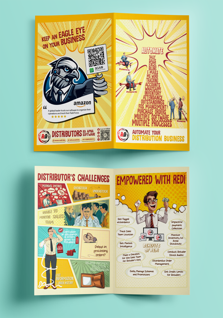
Branding collaterals are the everyday moments where your brand is seen, touched, and judged—often without a second chance. From business stationery to marketing material, these pieces may seem silent, but together they shape credibility, consistency, and recall. We design collateral that doesn’t shout for attention, yet speaks clearly and confidently for your brand, ensuring every detail aligns with your identity and strengthens trust over time.
